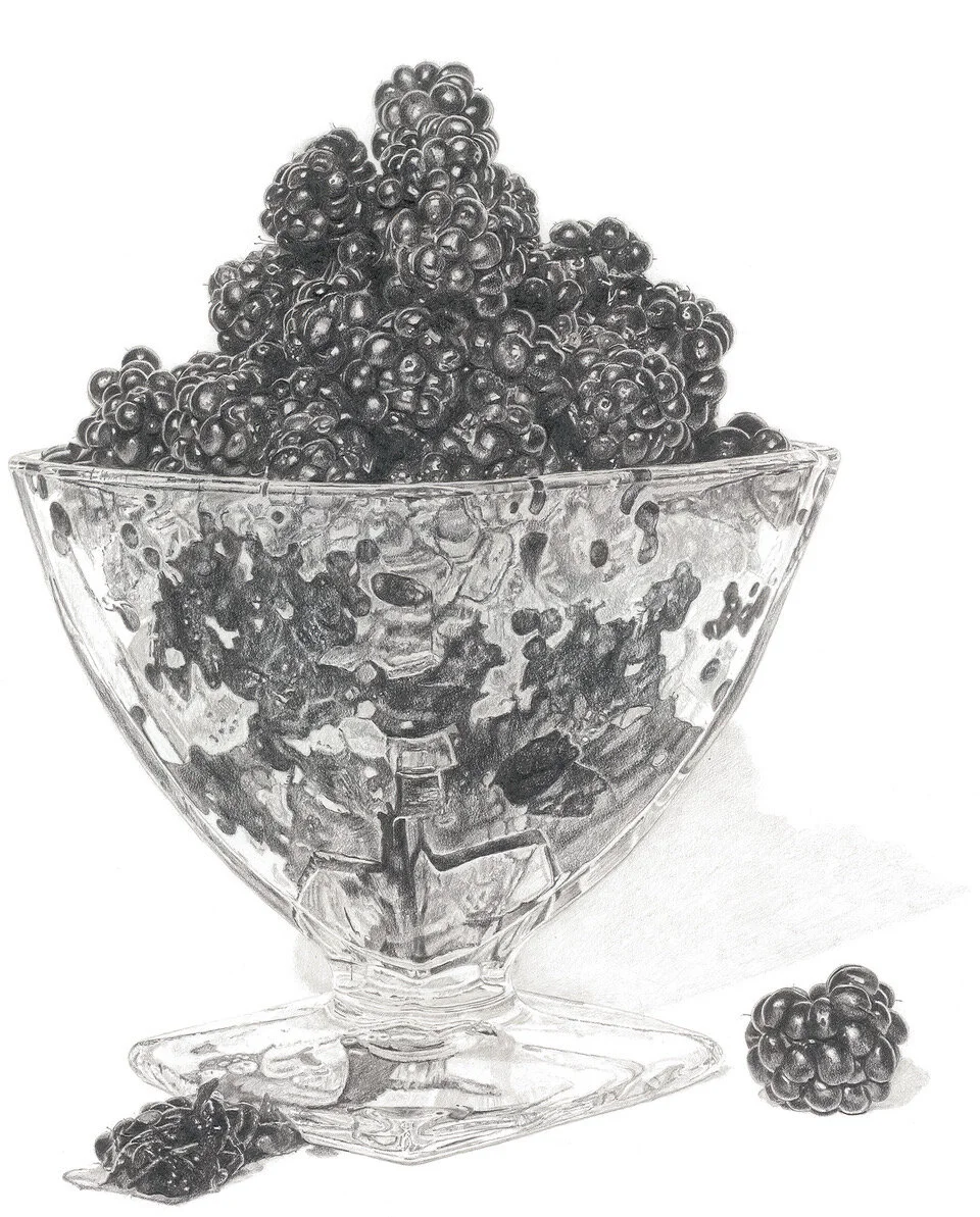
The idea for this painting of blackberries continues with the theme of food in clear containers. I find the sharp contrast between the top jewel like berries and the soft muted colours, as they are squeezed below the surface of the glass bowl fascinating to study.
Much of the inspiration behind this piece comes from my love of blackberrying and cook book illustrations.
Bumper crop of blackberries
As well as being inspired by Andy Warhol’s use of the blotted line technique, I am interested in the way he used simple bold compositions, particularly in the cook book Wild Raspberries, that he created with Suzie Frankfurt.
One of the reasons I chose the title Wild Blackberries was because of this book and also as someone once referred to one of my other drawings with this name, it sounded so strange as I have never thought of them as being wild. It’s funny how words can have so many meanings. I always associate wild with ferocious and that conjures up a whole other image.
Illustration from Wild Raspberries by Andy Warhol and Suzie Frankfurt
The illustrations from Mrs Beeton’s Cookery Book are another example of simple composition. There is an elegance and beauty in the way the vegetables are arranged. I particularly love the peas with their starburst of bread triangles and the way the colours of the carrots and French beans are reflected on the platters.
Postcard of vegetable dishes from Mrs Beeton’s Cookery Book 1904
Also on my travels I came across this fantastic vegetable display by Medwyn’s of Anglesy at the Chelsea Flower Show. Not only are they perfect specimens, the composition lets the subject breathe and they make me smile.
Vegetable display by Medwyn’s of Anglesey at Chelsea Flower Show.
As with most of my work I like to begin with drawing. I used a staged photograph as the berries didn’t last long and I wanted to draw it larger than life. I try to capture as much detail as possible so that when I come to trace it for printing, there is lots of information to choose from.
Pencil drawing of Blackberries in a Glass Bowl by Lucy Clayton
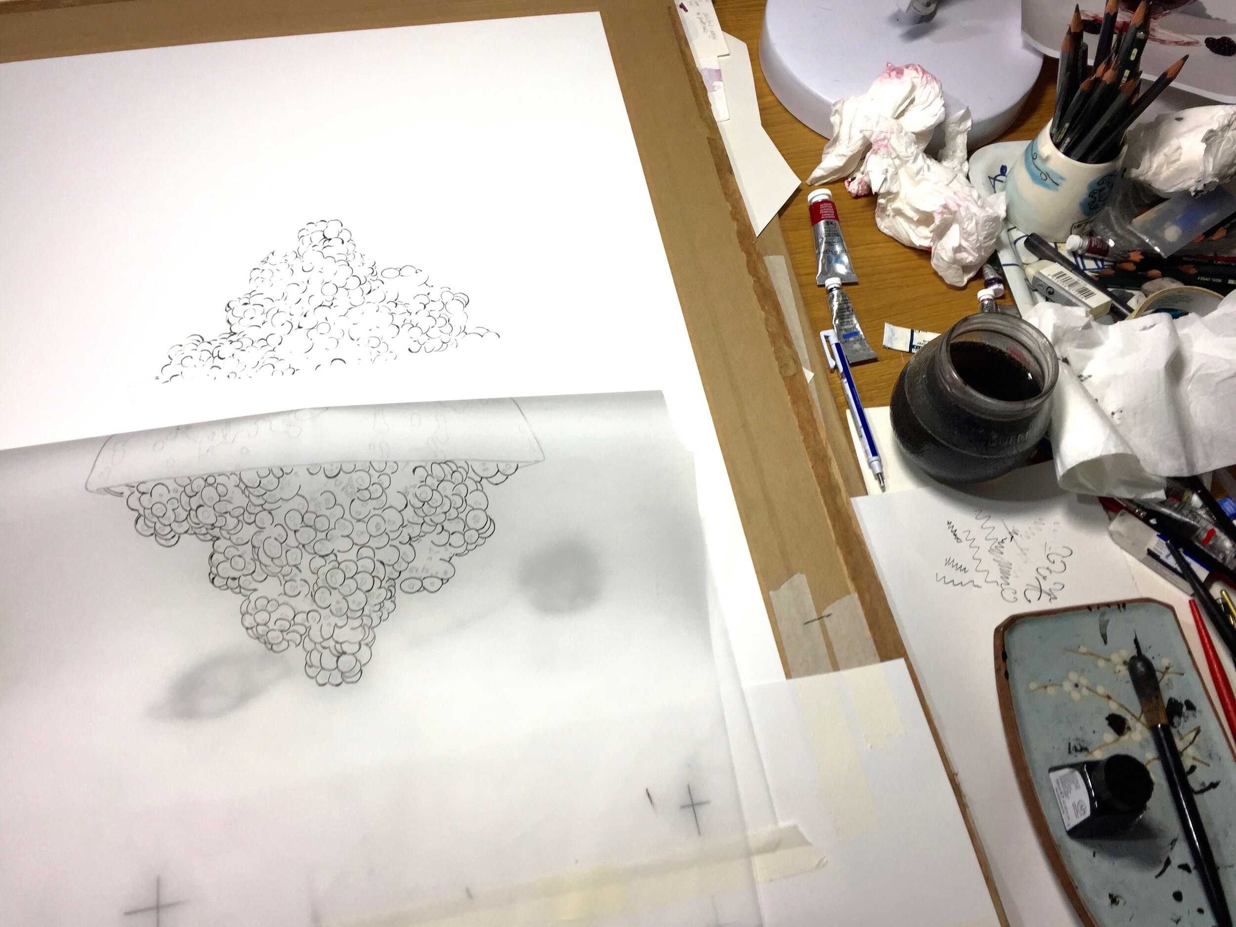
The blotted line technique is a very simple way of mono printing using tracing paper and drawing ink. I enjoy combining it with watercolour painting as it give a different texture to my drawing marks.
I decided to only print the fruit so that the glass bowl would be a delicate contrast to the intense purples and reds of the berries.
Printing using the blotted line technique
The main purples for this piece were based on Alizarin Crimson and French Ultra Marine with other colours added, including indigo for the darker washes. I always begin with a few nervous pale washes and gradually became bolder.
It was interesting to study the colours of the blackberries - as your eyes adjust to the darkness, more hues appear and you can see warmer reds and cooler purples. I find it easier to look at the tones in my original drawing and then work out a range of washes and go from there.
Watercolour palette
Each new painting brings a different set of challenges -the soft bloom like reflections on the underside of the glass were difficult to understand at first, so I painted around them as it was then easier to work them out once the other colours were in place.
Pale watercolour washes
Using original drawing as a guide to work out tones in watercolour.
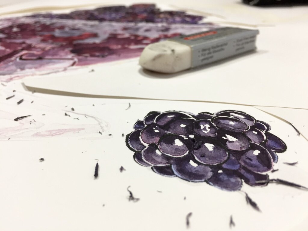
Removing masking fluid.
Removing the masking fluid and pencil lines helps to see the painting with fresh eyes. I then soften and adjust the highlights, add a few details and accept the parts I can not change.
I hope this painting captures some of the beauty and sensory qualities of blackberries that I see and taste.
Wild Blackberries, blotted line and watercolour painting by Lucy Clayton


